

Everfree Grayish Tactile Switch Performance
ThereminGoat's review of Everfree Grayish Tactile switch. If you want to read more, please kindly visit ThereminGoat original posts. HERE
Appearance
At the highest level, the Everfree Grayish switches come in an eponymously apt gray-ish colorway with gray-white translucent top housings, medium-gray opaque bottom housings, and white colored tactile stems. Amongst the broader backdrop of modern mechanical keyboard switches, these are fairly distinguishable just on this color scheme alone, however the “FAT” LED diffusers built into the top housings make this distinction just that much easier. A calling card of the Everfree brand of switches thus far into their history, these work to diffuse light from RGB compatible PCB designs rather well based upon at least what the marketing photos for the Grayish tactiles show on Gateron’s website. Beyond these most immediate eye catching details, there are still quite a few unique design quirks with the Everfree Grayish tactiles that both help in their identification and help separate them from Gateron’s other designs. These details are covered in the following paragraphs, below.

Figure 6: Everfree Grayish tactile switches and their components.

Figure 7: Example of colored LED light diffusion through Grayish tactile switches from Gateron's sales page.
Looking first to the milky, translucent polycarbonate top housings of the Everfree Grayish tactiles, these housings immediately demonstrate from the jump that Gateron has put efforts into making these design of these switches something standalone. Most notably is that of the LED/diode diffuser which has been mentioned already several times over in this review. Two thirds as tall as the front side of the top housing’s southern wall, this diffuser has a fingerprint-like series of concentric circular rings on the top side of the diffuser which don’t readily appear to serve any functionality to improving LED diffusion at all. Externally, the top housings also feature an inverted, italicized nameplate that reads ‘EverFree’, partially adding to the confusion as to whether or not the ‘f’ needs to be capitalized. Internally, the top housings don’t really appear to have any design quirks that make them unique and/or separate them from really any other modern switches available out there today, let alone from Gateron’s other offerings. The only details worth noting here that aren’t super obvious in the photos of the top housing interior, below, is that of the two capital letter mold markings located in the upper left- and right-hand corners of the housing underneath the nameplate region. Perhaps mentioning that the diffuser built into the top housings is not solid, and instead partially hollow, may be worth pointing out to some – though know that this isn’t all that uncommon in other switches which feature such designs, such as recent TTC offerings.

Figure 8: Everfree Grayish Tactile top housing external design showing inverted and italicized 'EverFree' nameplate and bulky LED light diffuser.
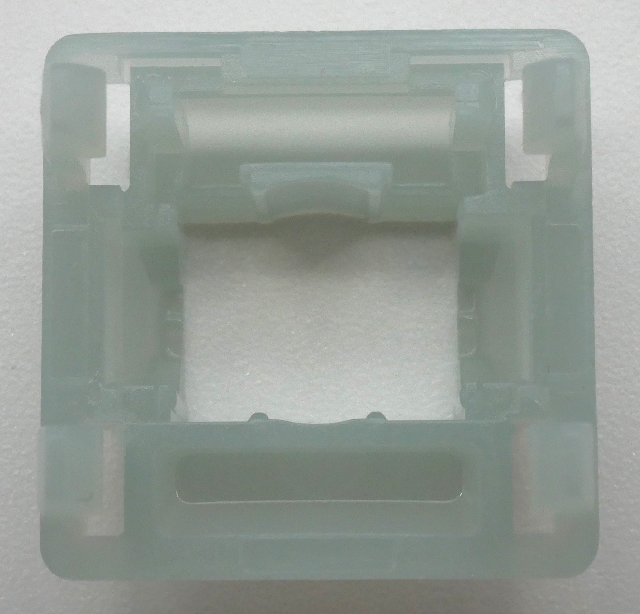
Figure 9: Everfree Grayish Tactile top housing interior design showing capital letter mold markings in upper left- and right-hand corners.
Moving next to the white, (assumedly) POM stems of the Grayish tactiles, these are surprisingly barren of any modern switch design flourishes and are notable in just how ‘basic’ they are compared to most other modern Gateron switches. While I understand that the Everfree switches were designed as being budget friendly, no extra frills switches which are easier to manufacturer, I would have at least expected that Gateron would still taper a slider rail, or make the stem pole at least a little more or less aggressively tiered. Instead, what is presented is a pretty bog-standard representation of an MX-style switch stem – squared off slider rails, normal looking center pole, mold ejector circles on the front plate, so on and forth. (This is minus the exception of the angled corners on the backplate of the switch, though it’s only an exception among all switches, as it has been seen before in other Gateron switches.) The stems are at least notable insofar that they are ‘long’ to reduce the overall travel distance of the stroke, coming in at 13.63 mm in length, which is a touch longer than the average stem length I’ve measured at 13.09 mm. (Current running average as of the time of writing is based on 492 other different switches measured.) What little factory lube was present on the stems of the switches was pretty evenly dispersed on the slider rail sides of the stem as well as a tiny bit on the stem legs, as well. While clearly not as heavy nor intentionally placed as in some of Gateron’s most premium offerings (e.g. Oil Kings), the application here is still pretty solidly done and is definitely still using some of Gateron’s improved lubing technology to do so.
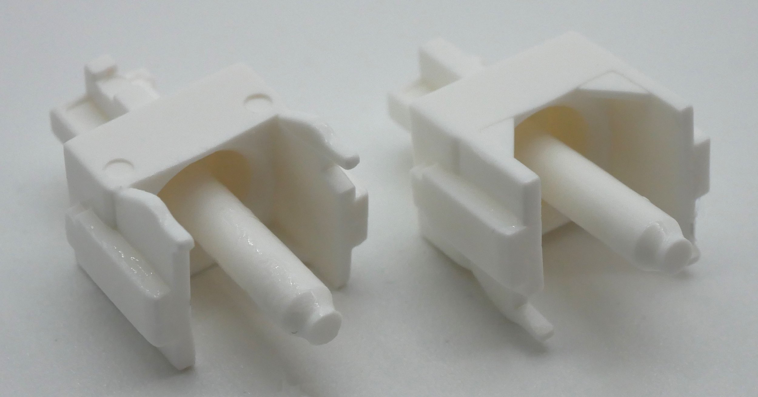
Figure 10: Everfree Grayish Tactile stem front and back showing angled backplate cape, non-tapered slider rail, long stem pole, and front plate ejection mold circles.
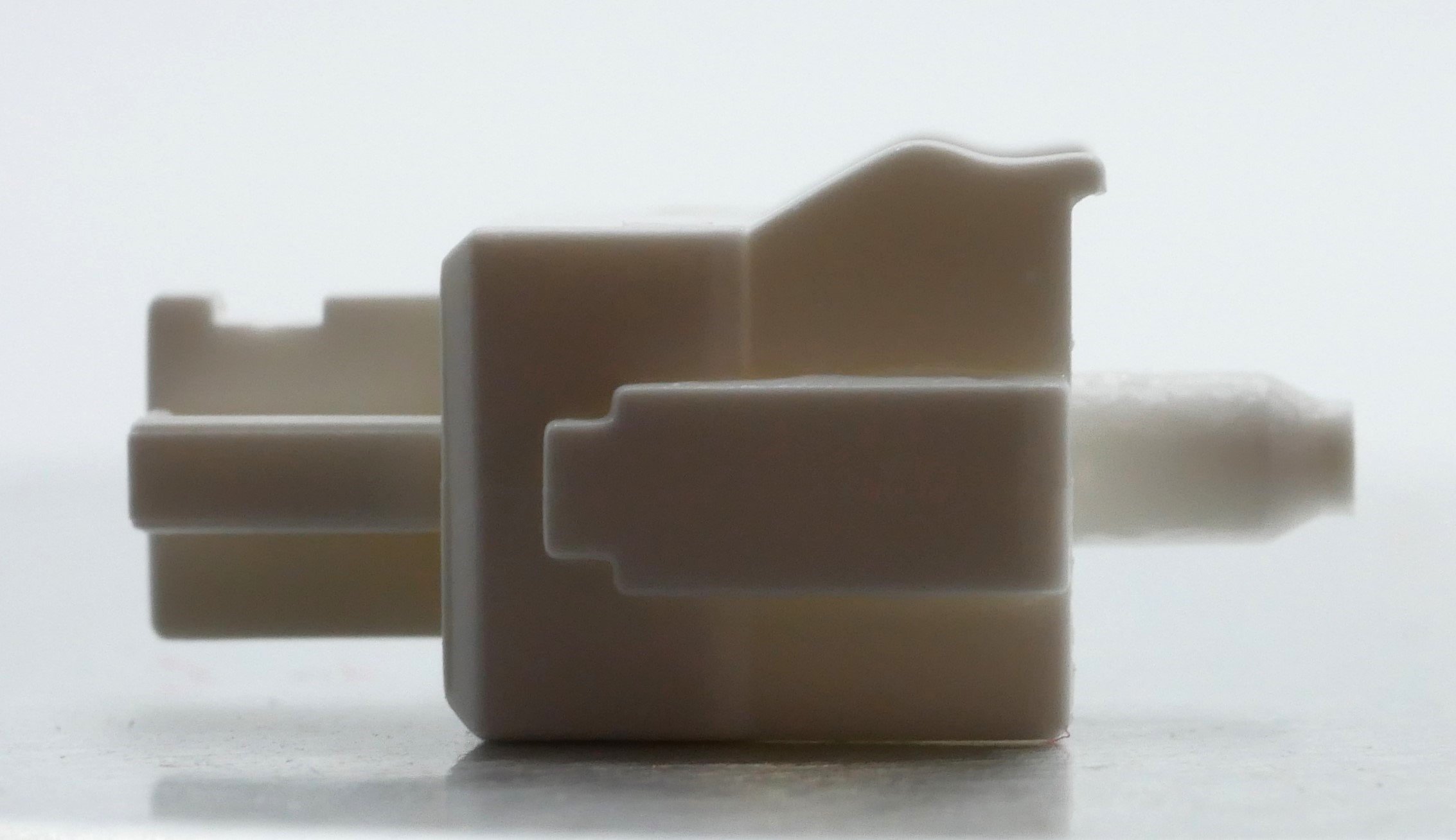
Figure 11: Side profile of Everfree Grayish tactile stem showing profile of tactile bump.
Arriving to the opaque grey, nylon bottom housings of the Everfree Grayish switches, these again return to featuring quite a few design details which help separate them from Gateron’s other offerings. Internally, the first thing which jumped out to me is the general lack of free space in the base of the bottom housing. While bottom housing ‘roominess’ is not something I have often pointed to in this section, the aggressively large south-side spring collar really does make for a densely packed housing construction. Amidst this, though, you can still very well pick out dampening pads at the base of the slider rails as well as small mold ejection circles. Additionally interesting in the Grayish tactile is the presence of some different mold spots/padding structures on the upper rim of the bottom housings, most notably in the from of thin, vertical rectangles located around the hollowed out LED/diode slot section. Externally, these switches also feature quite a few mold markings which make them unique. In addition to the two single-letter mold markings in the lower left- and right-hand corners, these switches also feature a sideways ‘EF’ marking located between the metal PCB pins in similar fashion to “Gateron” anticounterfeit stamps located between these pins following the Stealios Controversy. If it wasn’t entirely clear from the photos below, these switches come in 5-Pin/PCB mount construction.

Figure 12: Everfree Grayish Tactile bottom housing interior design showing south side spring collar, dampening pads at bottom of slider rail, and assorted mold markings.

Figure 13: Everfree Grayish Tactile bottom housing exterior design showing capital letter mold markings in lower corner, 5-Pin/PCB configuration, and sideways 'EF' marking between metal PCB pins.
Push Feel
Upon first testing the Everfree Grayish tactile switches out, they read to me as a medium-heavy tactile switch with a wide tactile bump that starts towards the very top end of the downstroke and smoothly fades to an abrupt point at a stunted bottoming out. These switches might have the tiniest bit of linear pretravel to them, though admittedly I both don’t see it in the force curves and think that it is likely something that I’m just imagining in my head as I’m typing away at them on my tester. There really doesn’t feel like there is much, if any, of a post-bump linear region to the switch, which is in large part due to the lengthened stem pole cutting this section short and ending the downstroke at around 3.20 mm of total stem travel. In similar fashion to how I’ve done with other tactile switches in the past, I then went on to try and find a comparative switch to loosely toss in here for those of you who don’t make it all the way to the comparison section below. However, I could swear up and down that I’ve tried these tactiles before. Something about their bump, bottoming out, and overall feeling just echoed through my mind, leaving me continually searching for an apt comparison. That is, until I found one:
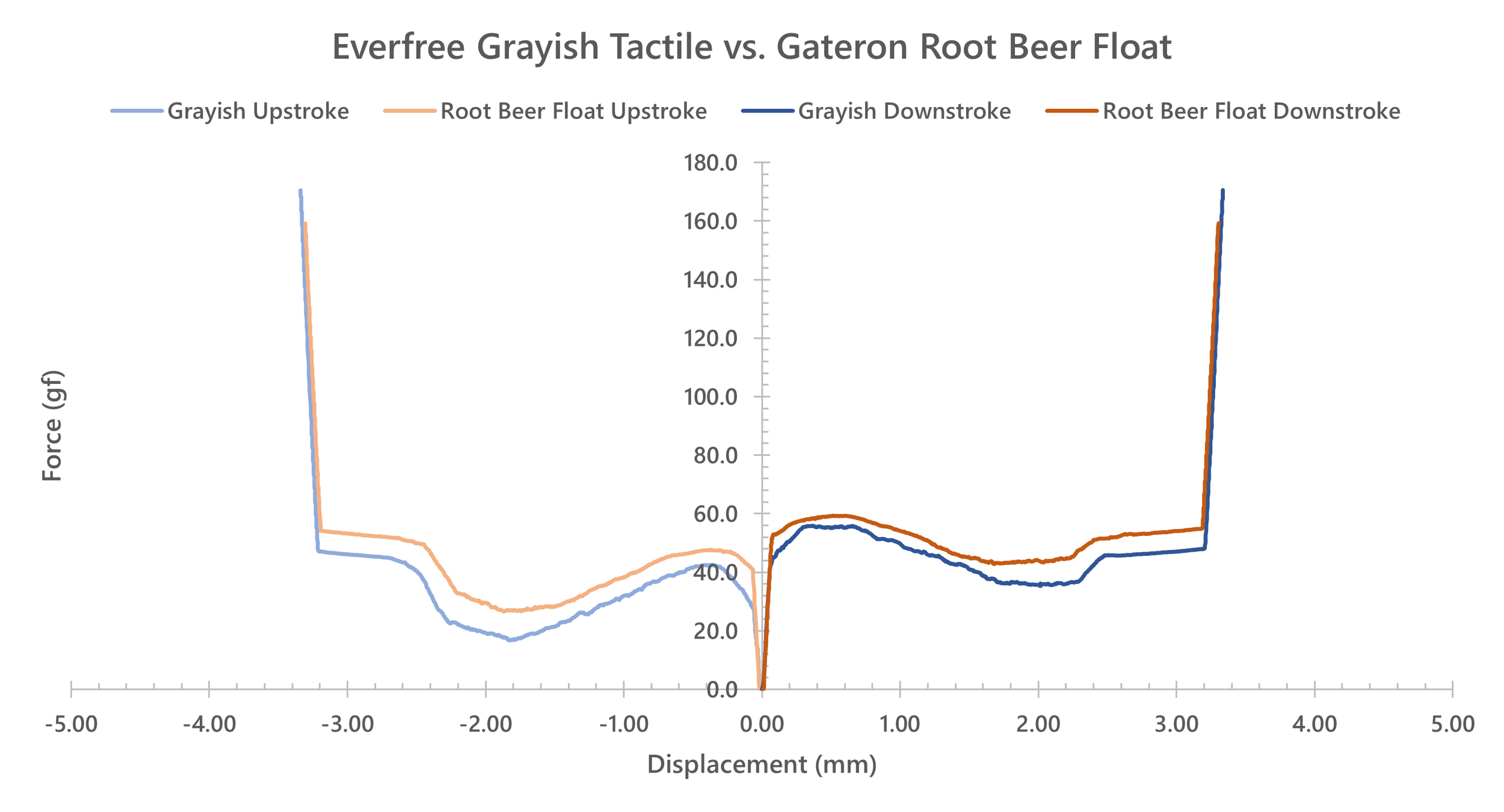
Figure 14: Comparative force curve diagram between Everfree Grayish Tactile and Gateron Root Beer Float switches.
Sound
The sound of the Everfree Grayish tactiles, as subtle as it is, is largely driven by the scratch sound that permeates throughout the strokes of nearly every switch in the batch. Surprisingly, neither the polycarbonate top housing nor lengthened stem pole do much to impact the sound profiles of these switches around this scratch as well. Instead, all these two features do is act to add a barely pointed thud to an otherwise quiet overall tone. Unfortunately, both in terms of direct impact as well as due to its similarity to Gateron Root Beer Floats, the Grayish tactile switches also have a decent number of switches which have a pinging sound to them. Given the rounded, snappy nature of this metallic tone, I’m almost certain it is related to the interface between the stem legs and the leaves rather than a function of the spring in the switches. Thankfully, there is some differentiation between the Grayish tactiles and Gateron Root Beer Floats, here, as the nylon bottom housings of the Grayish switches lend to bottom outs which are more firm, muted, and less sharp sounding than the comparatively higher pitched, thinner sounding bottom outs onto the Ink thermoplastic bottom housings used in the Root Beer Floats.
Wobble
There is a noticeable but not likely super problematic amount of N/S and E/W direction stem wobble in the Everfree Grayish tactile switches. This stem wobble is equal in magnitude in these directions and doesn’t appear to vary across the batch that I received nearly as much as the scratch feeling and sound. While certainly more noticeable than in most other Gateron switches to date, this amount of wobble is quite good compared to other switches within this price range.
